
Interior Design Lessons From FRIENDS: What Monica’s Apartment Still Teaches Us Today
Monica, Rachel, Phoebe, Ross, Joey, and Chandler—names we all remember. FRIENDS, the iconic sitcom that aired from 1994 to 2004, became far more than just a comedy show. Even years after it ended, it remains deeply rooted in pop culture, with fans constantly discussing everything from its characters to its fashion and, surprisingly, its interior design.
Although FRIENDS was a sitcom, the show brilliantly showcased how thoughtfully designed indoor spaces can shape comfort, creativity, and connection. Since most scenes took place inside apartments, the show unintentionally became a source of interior inspiration. And when we talk about interior design in FRIENDS, Monica and Rachel’s apartment will always be the heart of the discussion.
Below, we break down everything we learned about home décor and interior styling from this unforgettable apartment.
1. A Smart Layout Makes All the Difference
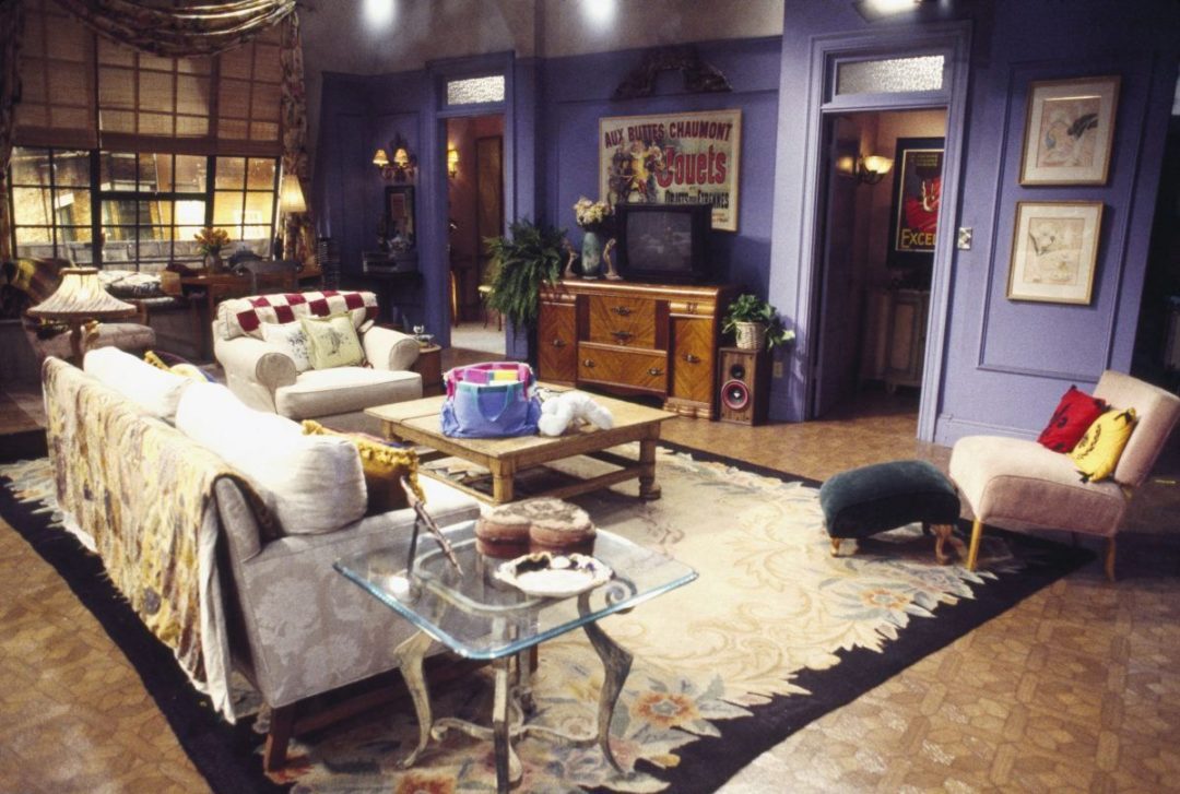
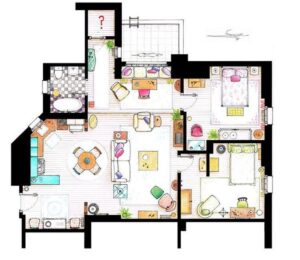
One of the strongest elements of Monica and Rachel’s apartment is its balanced layout. Every room was arranged with flow and functionality in mind. There was no overcrowding of furniture, nor were there awkwardly empty corners. Everything had a purpose.
The result?
A space that felt open, breathable, and easy to move around—showing how important it is to avoid unnecessary furniture while still keeping the room complete.
2. Bold Colors Can Be Beautiful
Modern designs often move toward neutral shades, but FRIENDS proved that bright walls and patterned floors can add personality and charm when used thoughtfully. Monica’s apartment showcased bold purples, warm yellows, colorful floor tiles, and rich lighting that created a unique visual identity.
Bright colors are not “too much” when they complement each other—something modern homes can still learn from.
3. Rugs Are Magical Room Dividers
A rug is one of the easiest ways to define functional zones within a large room. FRIENDS demonstrated this perfectly with the rug placed under the living room sofa set. Although the dining area and living area were part of one large room, the rug separated them visually and made each section feel intentional.
If you have a combined living–dining space, a rug is your best friend.
4. Dining Should Fit Your Space—not the Other Way Around
People often think a dining area must be big and grand. But Monica’s apartment proved otherwise. Despite being the “hangout spot,” the dining area had a small round table that perfectly matched the apartment’s size and needs.
The lesson?
Choose dining furniture based on the number of permanent residents—extra guests can always pull up a chair when needed.
5. Kitchens Need Light and Breathing Space
The kitchen in Monica’s apartment worked beautifully because it had a window for ventilation, keeping the space fresh and lively. The layout connected directly to the dining area, making movement natural and efficient.
Good kitchen design isn’t just about aesthetics—it’s about airflow, accessibility, and how the space supports everyday activities.
6. Create a Study Space Near Natural Light
Although the apartment didn’t have a dedicated study room, it had a functional workspace cleverly placed near a large window. This is an excellent reminder that you don’t need a separate room to create a productive corner. Natural light boosts focus and mood, making it the ideal spot for reading, studying, or working.
7. Mix and Match Sofa Arrangements for Comfort
The living room sofa set combined different types of seating:
-
a single-seat sofa
-
plus one extra comfortable chair with a footstool
Instead of adding another bulky sofa, the additional chair introduced texture and contrast—making the set visually richer.
The key takeaway: Your seating doesn’t have to match perfectly; it needs to feel balanced and practical.
8. Smart Use of Space Makes a Home Truly Functional
FRIENDS made clever use of storage throughout the apartment:
-
cabinets above the refrigerator
-
storage under the TV unit
-
well-placed shelves and stands
The furniture layout made sure the dining and living areas felt distinct, while still being part of the same open space.
Although a tiny cabinet above the fridge isn’t ideal in real homes today, the message is timeless: storage should be planned, not improvised.
9. Bedrooms Should Prioritize Comfort, Not Clutter
Both bedrooms in the apartment followed a simple, minimal formula:
Nothing unnecessary. Just the essentials.
This made the rooms cozy, breathable, and focused on rest—a design principle that still stands strong today.
10. Walls Come Alive With Posters and Art
The posters and artwork displayed throughout the apartment added charm and personality. They weren’t just decoration—they brought the warmth and memories of the 90s into the space.
Empty walls can feel cold. A meaningful poster or artwork can instantly make a room feel lived-in and expressive.
Final Thoughts: Design Inspiration That Stays Timeless
Whether you’re a devoted FRIENDS fan or simply someone looking for fresh interior ideas, Monica’s apartment is a treasure chest of design inspiration. It champions creativity, comfort, color, and clever space management—principles that remain relevant today.
And if you’re planning to style or restyle your home, HATIL is always ready to help you bring these ideas to life with thoughtfully designed furniture that blends function and style.