
The bold colors are the new black! Just a few years back, the interior design of bright hues couldn’t be seen. It’s time to embrace the bold colors and make our interior vibrant. Colors have their own characteristics and play a huge role in energizing your ambiance and lifting up your spirits. Architects and designers have started using vibrant colors more to engage people and design closer.
Bold colors are fun and vibrant. But to make the specific vibe with bold color in your interior design, there are some twists to balance them out. Unplanned mixing of colors may make our brain tired. So we are here with some idea of balancing out trendy and bold colors!
The combination of Orange and Gray is a treat to eyes!
Choosing your color palette
Bold colors are very eye-catching and attractive. We just get confused which one to choose and not to choose. Even if we choose, it’s difficult to make a perfect blend. Understanding how to employ bright colors to their full potential is the key to making them work.
Generally, three colors are chosen from the color palette to design a space. Yellow is one of the brightest colors and very trendy in interior design. To complement this color, violet and blue can be chosen for a vibrant look. Again, Black or gray will create a semi formal look. That’s how the color palette varies the tone of a space. It needs to be chosen according to space and use as well.
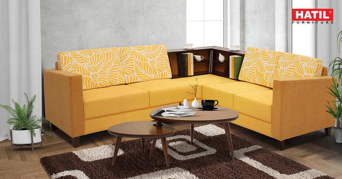
 Salamander-244 can create a vibrant look in your living room
Using the neutrals!
Isn’t it weird to see this headline on the topic of using bold and trendy colors in interior design? Yes, it may be. Neutrals are your hidden weapon when working with bright colors. These colors give the eye a break from the vivid color, allowing the rest of your design to be as bold as you like.
There is no way to think that adding neutrals is boring. Whites, gray, silver, gold etc are considered as neutral. So neutral color can make a new dimension in interior design.
 Magic of Neutrals!
Trying vertical stripes
To make a small room look bigger, vertical stripes have been used for a long time. But creating the stripes of bold colors is a newer addition to interior design. Stripes of bold color add a character to the room and the wall becomes the center of attention.
Following the rule of 60-30-10
As there are many options in choosing bold colors, balancing is important. Otherwise the purpose of using bold colors won’t be fulfilled. Interior Designer Mark McCauley proposed the rule of 60-30-10 and claimed that it works every time.
The main concept of the rule is to demonstrate the colors into components of 60 percent of a dominant color in walls, 30 percent of a secondary color in upholstery and 10 percent of an accent color in other accessories. This rule is a perfect combination of expressing bold color with the help of other colors which ensure enough pop for interest.
Keeping it simple or making variations?
Overdoing with colors may create disturbance to the eyes. Simple and symmetric color choice can be a safe option.
But in informal places, various colors can bring happiness and comfort. Following rules in this case can be an example of lack of imagination. Playing off different shades, hues and tints of a color can create an amazing interior.
 Use of patterns are trendy too
Embellishing the room with curtains, rugs and paintings
Curtains and rugs are necessary accessories in every room of our home. They can be a way of balancing out the bold colors or can be a component of using bold colors according to the designer’s choice. They can be in solid color or patterns. To balance the bold color in the space, curtains or should contrast the wall or other furniture. Or they can be of different shades of any particular color. For consideration, indigo, sky, azure, aegean, navy etc are shades of blue.
Keeping an art painting is a way of personalization in decorating a room. In modern apartments and offices, painting is one of the decorative components. An artistic mind becomes delighted seeing favorite paintings. Painting not only adds an aesthetic value in the room but also helps to balance the color existing in the room. The scenery of the blue ocean or a moment of dusk will itself create a bold appearance!
 Paintings/photographs along with furniture pop the interest
Interior design is very crucial in a modern apartment, office or any space. As per trend, it’s more necessary to learn about them thoroughly. Using bold colors may seem pretty easy but balancing them out is the key to your beautiful interior. What’s your favorite trend for interior design? How have you planned to balance the bold colour? Let us know in the comment section!