Interior design of your home might seem bland and dull if you don’t choose visually appealing interior color schemes with contrasts. Color contrast in your design may help to build a focal point and a hierarchy of importance. You can use this design approach to direct people’s attention to a certain part of a room without actually telling them that’s what they should be staring at.
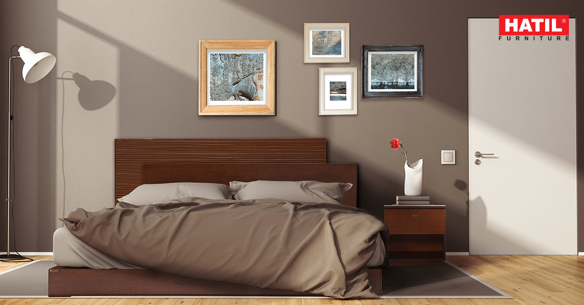
 Shades of grey for a bedroom with mixtures of dark hues of wood can look sophisticated and elegant
There are many aspects of interior house design that must be considered in order to make your home look beautiful in the long run, but colors play a major role in what design is really about. They build a home environment in various ways, allowing you to subtly influence yourself and your guests.
Without any further ado, let’s check out how contrasting colors can have a magical impact on your home decor.
Contrasting with Light and Dark Colors
 Lighter shades of walls can be contrasted with darker shades of furniture
If you love wooden decorations, there are many shades from light to dark. You can play with the color of woods for your furniture, floors and walls. You can opt for lighter shades of wood majorly for your smaller rooms if you want them to look bigger. On the other hand, dark hues may contribute warmth and comfort in your living space, both in obvious and unexpected ways. You can contrast dark walls with lighter shades of furniture. They can add depth and warmth in a dramatic yet cozy way. For example, a dining room with lighter shades of walls with a dining table of darker shades of wood can be a great match.
Contrasting with Bright and Cool Colors
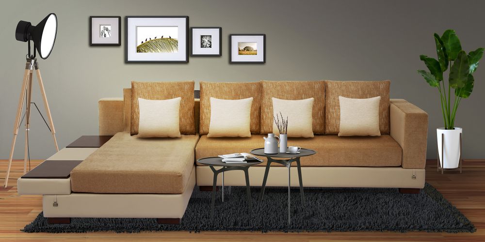
 Bright color couch with a grey toned walls can make your living room look daunting
When it comes to this color scheme, the options are versatile. It’s all about your own creativity and aesthetics. We all know that bright colors like yellow, orange or red can make a room look cozy and warm. In contrast to that, cool colors like blue, green or teal can make your room appear much bigger and spacious. You need to decide which option to go for in accordance with the type of your rooms or living area. The goal of this color scheme technique is to provide a sense of harmony in the interior design. You can go with a cool toned bedsheet by topping it off with some bright colored pillows for your bed. In your living room, you can get a bright colored sofa by contrasting it with the cool toned walls.
Contrasting Monochromatic Colors
 Applying different shades of same color don’t always look monotonous
If you are not confident enough in playing with colors, a monochromatic color scheme can be a great option for you. Monochromatic color schemes provide many options in interior design as they allow a wider range of contrasting tones by grabbing attention and creating focus. The application of a monochromatic color scheme creates a strong visual sense of cohesion. There is a common misconception about monochromatic color schemes. It is that there can be only one color and no different shades whatsoever. But that is completely not true. If you want to decorate your room with a specific color, you can use different shades of it. For instance, if you want to go for green you can also choose candy apple, mint, sage, lime etc. Prospero-110 is a combination of different shades of teal and can be contrasted with a teal wall.
Contrasting with Versatile Colors
 Pairing sage green with grey can be a great color contrasting choice
Can’t choose a definite color scheme? You can just simply go with anything! To help you out, let’s talk about some unusual color schemes that you haven’t thought of. If you love soft yet cool tones, mint and grey can be a nice match for you. An interior with mint walls and contrasting it with grey or darker shades of furniture can look fancy and dreamy. Sapphire and Mustard, Teal and White, Pink and Grey and many more can be great color combinations for color contrasting. It can not only be furniture or walls but also rugs, decors etc. Citron-250 comes in a bright terracotta color and can be contrasted with a teal or grey wall.
Contrasting Colors with Patterns
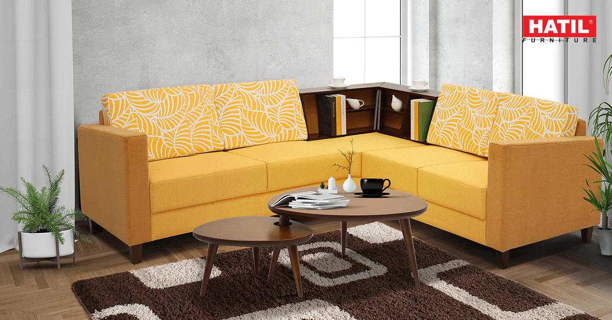
 A sofa with bright yellow pillow with geometric designs with grey textured cushions
Patterns and textures along with colors can make a huge difference in your interior designing. These effects can add more depth and make your living area look edgy. It also gives an artistic aura in your room’s visual theme. When it comes to interior design, coordinating contrasting colors and coordinating fabrics can seem daunting. The right combination of textures, patterns, and colors can create visual interest to your interior decor and make a home feel more personal. For instance, pairing up a sofa with grey hues and textures with bright yellow pillows with a geometric design by neutralizing it with a dark grey wall can be a great choice. Liverpool-216 is such a sofa.
The choices are limitless when it comes to contrasting colors. Color contrasting your home’s interiors doesn’t have to be a chore, and it doesn’t require you to be an interior design expert. Combining different colors creates a pleasing balance between the colors, which makes it possible to use a vibrant color without making a room seem heavy or overbearing. Striking the right balance between the colors takes some finesse, but the outcome is worth it.